Here it is, my submission for the most important graph in the world:
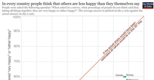
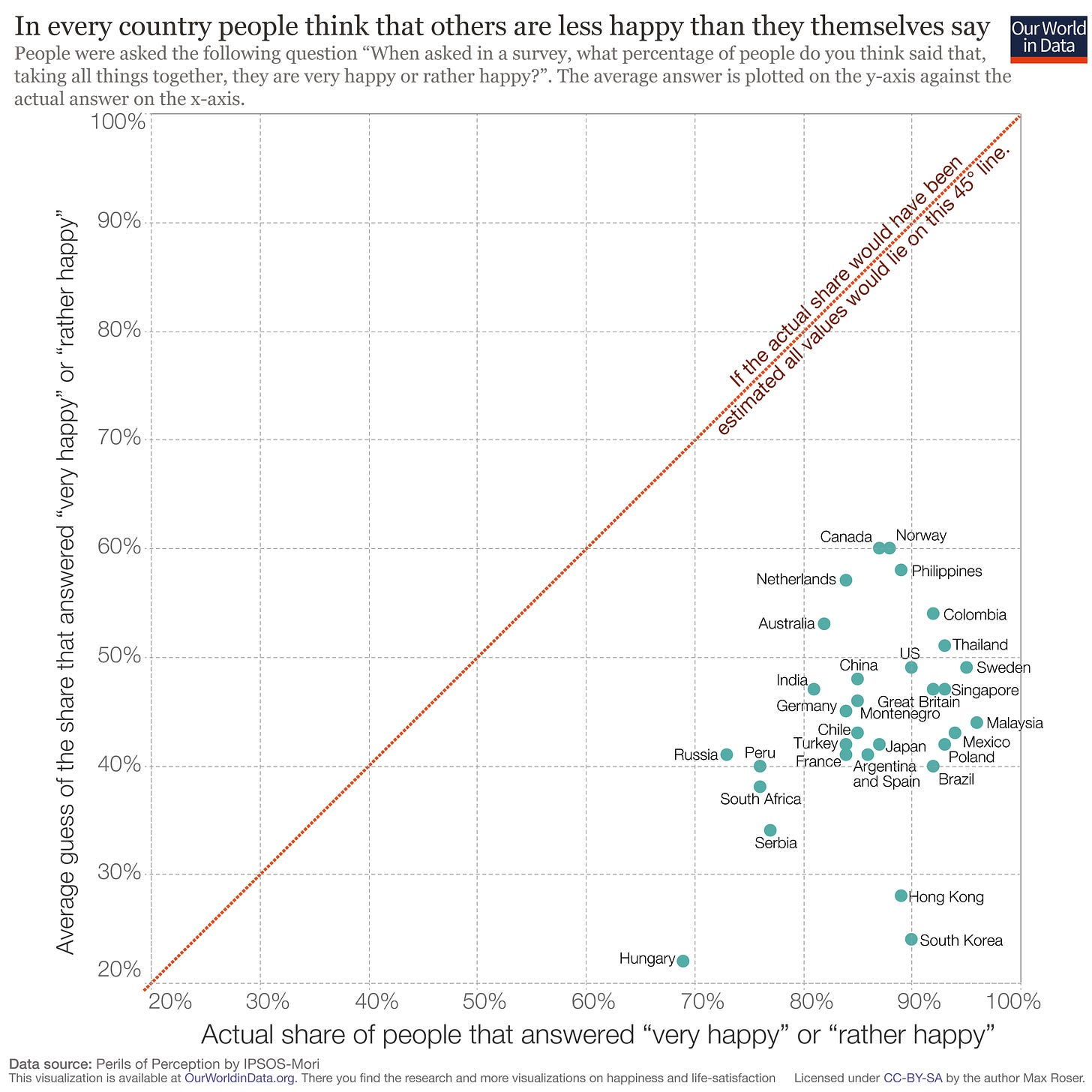
The visual comes from Our World in Data and the underlying data comes from the Perils of Perception study by IPSOS-Mori.
The graph shows that across all of the countries surveyed, people universally think that others are far less happy than they actually are. This graph more than any other shows exactly why a worldview rooted in countering negativity bias is so important.
27,250 survey respondents were asked the following question, “When asked in a survey, what percentage of people do you think said that, taking all things together, they are very happy or rather happy?”
The average guess for respondents is plotted on the y-axis. The x-axis shows the average actual self-reported happiness for the same countries according to the World Values Survey.
What’s so shocking about this graph is just how stark the results are. If the guesses and the actual results were similar, the plotted countries would fall along the center 45-degree line. Instead, all countries cluster in a tight pattern almost unheard of in social science in the bottom right of the graph.
This result shows that universally, people think that others are much less happy than they actually report themselves to be. People tend to guess that only 20-60% of people in their same country rate themselves as rather happy or very happy. In fact, 80-95% of people self-report as being rather or very happy.
What’s even more shocking about these results is that even the two countries who are most optimistic about their fellow citizens – Canada and Norway – only estimate that 60% of their respective populations rate themselves as happy. Not only is this far below the 88% and 89%, self-reported happiness scores for those countries, but it also falls below the least happy country in the survey, Hungary, which comes in at 68% actual self-reported happiness. This means that there is absolutely no overlap between the guesses and the actuals.
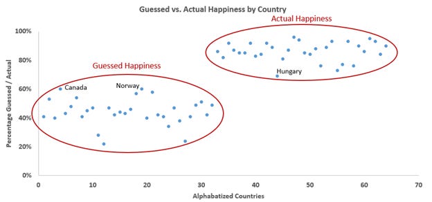
Visualized another way, here is every country alphabetized twice, with each country’s guessed happiness on the left and actual happiness on the right. The graph shows that there is absolutely no overlap between the two groups, not only for individual countries, but for the entire sample size as well. The most optimistic guesses (Canada and Norway) are still lower at 60% than even the least happy self-reported actual (Hungary), which comes in at 69%.
Here's the same data split out for each individual country:
Not only does every single country underestimate their own happiness, but the average difference is a whopping 42%.
How can everyone be so wrong about the happiness of others? Negativity Bias is a strong answer. Negative news and narratives overwhelm us daily, so it’s no wonder we tend to think that most other people are horribly unhappy.
You might respond that self-reported happiness can be misleading, but in social psychology, given the nature of subjective well-being, self-reported happiness is considered a great way to gauge life satisfaction. After all, since happiness is subjective, who can gauge your own happiness better than yourself?
Interestingly, we are pretty good about gauging the happiness of those we know personally, but are terrible at gauging the happiness of increasingly large groups that we don’t know, like our entire state, country, or the world.
This phenomenon can be thought of as a function of personal experience. There’s a base level of negativity bias that colors our perception of everyone, but that negativity bias is counteracted at the local level by personal experience. At larger and larger social levels, however, our personal experience dwindles towards zero, so the remaining negativity bias reigns supreme and colors our perception of large and distant groups incorrectly.
Another surprising takeaway from this data is that not only are the spreads between guesses and actuals large, but the absolute values of the actual self-reported happiness figures are large as well. Roughly 80-95% of people across the board rate themselves as happy. This is a huge proportion. It’s worth remembering that even though it’s easy to feel down about the world, 80-95% of people generally consider themselves happy, and that is a reason for optimism.
Honorable Mention
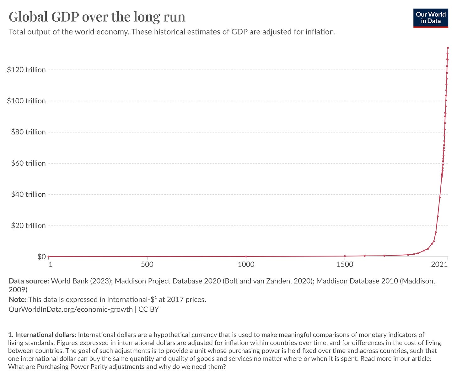
To get ahead of another clear frontrunner for the most important graph in the world, the graph below was an honorable mention. The incredible increase in material abundance over the past 200 years is likely the most important thing that has happened in human history. As one commentator put it, we’re already living in the singularity, we just don’t realize it yet.
The reason I believe the first graph is more important than this graph is because the happiness graph explains why the GDP graph is so poorly understood – our perceptions are horribly warped by negativity bias in a way that doesn’t allow us to fully understand or appreciate historical progress. Even though the Global GDP graph shows the most important trend in human history, the Global Happiness graph shows why this most important trend is so poorly understood and appreciated. Therefore, the happiness graph supersedes the GDP graph in importance.
Any Other Graphs to Consider?
Think a different graph is more important? Shoot me a message or let me know in the comments.
To qualify as “most important” I’m assuming the graph is:
1. Important, not just interesting – it should explain something significant about the way the world works
2. Strong takeaways – no weak relationships or disputed / non-repeatable results


"There’s a base level of negativity bias that colors our perception of everyone, but that negativity bias is counteracted at the local level by personal experience."
This is my favorite line from the whole article. I try to avoid this, but its so cathartic when I feel behind in life to know that someone else might be even further behind, or that I'm still above average. Hence I need to believe that society's average is relatively low. There's a lot of utility around this habit, so it'll be something I have to be aware of to break.
To me, the GDP graph is the single most important. I also really enjoyed creating this graph illustrating the improvement in the thermal efficiency of engines over time: https://www.lianeon.org/p/the-engines-of-progress